“ECHOES OF TYPE” ESSAY
PUBLISHED ON CIRCULAR 19 'THE EDITORS ISSUE' · ILLUSTRATIONS POL MONTSERRAT · SPAIN, 2016
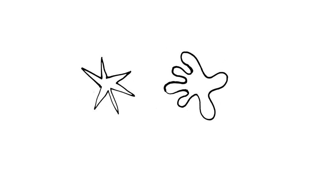
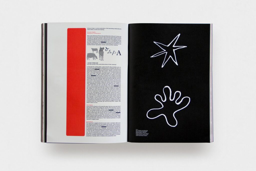
Alright – Let’s say one of these figures’ name is Bouba, the other one’s Kiki.
Which is which?
When I was invited to write something for a special issue of Circular I decided to answer these and more questions.
So I entered the slippery territory of Sound Symbolism: language and visual thought, the origin of the alphabet, the evolution of type, and so on.
The issue featured many brilliant minds of the likes of Dazed’s editor in chief, It’s Nice That founder
or New York Times design editor, among others. Quite an honour to be in such a good company.
“ECHOES OF TYPE” ESSAY
PUBLISHED ON CIRCULAR 19 'THE EDITORS ISSUE' · ILLUSTRATIONS POL MONTSERRAT · SPAIN, 2016
ECHOES OF TYPE: THE FASCINATING RELATIONSHIP BETWEEN LETTERS, SOUNDS, AND MEANING.
English only
Why do the letterforms that we see everyday look as they do? Is there any link with the sound they produce? Why could the word Humpty Dumpty resemble an egg-like character, while the word Kiki maybe wouldn’t? Knowing that the first and most archetypal letter of the alphabet used by 2.6 billion people across the globe derives from a cow head; how could this help a designer’s work?
To rid us from the obligation of finding certain answers, we explore the fascinating and mysterious relationship between typography, sounds, words and their meaning.
I. SOUND SYMBOLISM or DO THE SOUND OF WORDS HIDE ECHOES OF THEIR MEANING?

In Through the Looking-glass, Lewis Carroll’s Alice stumbles upon an enormous egg-shaped figure celebrating his un-birthday. She tries to introduce herself: “It’s a stupid name enough!” Humpty Dumpty interrupted impatiently. “What does it mean?”“Must a name mean something?” Alice asked doubtfully. “Of course it must,” Humpty Dumpty said with a short laugh: “My name means the shape I am – and a good handsome shape it is, too. With a name like yours, you might be any shape, almost.”
Until recently, according to the conception universally-agreed between most linguists that words are a mere collection of sounds, unrelated to any actual meaning, what Lewis Carroll’s egg-like character said to Alice was pure nonsense. The idea that names —and thus every vocal sound—carry meaning in and of themselves has always been there, mysterious and fascinating. Pulling the camera back a bit, exactly in 1595, Shakespeare included in Romeo and Juliet the lines “What’s in a name? that which we call a rose / By any other name would smell as sweet”, giving somehow his personal take on the issue.
And we can go even further back than this. In Plato’s Cratylus, Socrates sees the creation of a word as art: as the artist who outlines his subject on a canvas using color and tints, the creator of words picks sounds and phonemes to generate meaningful semantic units. Socrates is asked by two men, Hermogenes and Cratylus, whether names are natural or conventional, the first arguing that the words we use are just a convention; while Cratylus, in the same manner as Humpty Dumpty, believed that language is not arbitrary and that within words reside echoes of their meaning, in virtue of the sounds they are made of. So far, linguists mostly agree on the assumption that words are nothing more than a conventional set of letterforms: modern linguistics suggests that the sign is arbitrary, that “boy” could mean “girl” and vice versa. But —maybe— this doesn’t mean it is true.

The fact of the matter is, that it’s not just you that paired the jagged shape with ‘kiki’ and the rounded shape with ‘bouba.’ You are in good company.
According to an article in Scientific American an astonishing 98% of people chose the same pairings. The smooth lines of the round shaped figure metaphorically mimic the fluid and gentle sound of ‘bouba’, while the sharp phonemic inflections of kiki matched perfectly to visually represent a jagged shape.
The experiment suggests that the human brain is somehow able to extract abstract properties from the shapes and sounds. These situations are usually referred to as synesthesia, in other words when one sensory stimulus is mixed with another.
Following their investigations on synaesthesia and its role in language, neuroscientists Vilayunur Ramachandran and Edward Hubbard demonstrated that we all experience in some way this connection between sounds, shapes and their meaning. The echo generated by these studies led to a renaissance of the assumption of Sound symbolism, a process by which characteristics of words are correlated systematically to specific articulatory or acoustic properties of sounds, both on imitative and synesthetic level.
Here is a rough classification:

Onomatopeia
This is the least significant type of symbolism. It is simply imitative of sounds or suggests something that makes a sound. It is fascinating to observe that the English term onomatopoeia comes clearly from the Greek language and it means the imitation of a sound, the compound word onomatopoeia (ονοματοποιία) means originally ‘making or creating names.’
Highness and lowness
In many cases, vowels somehow show a systematic correlation with the concept of size. Briefly, there is cross-species recognition and exploitation of the frequency code: the association of high acoustic frequency with smallness and low acoustic frequency with largeness. An example is chico and gordo (Spanish for ‘small’ and ‘big’): just a little example that amazingly finds correspondence in many languages — Greek’s μικρός (mikrós) and μακρός (makrós); French’s petit and grand; Italian’s piccolo and grande; Japanese’s 小さい (Chīsai) and 大きい (ōki), among others.

Clustering
This is the most, let’s say, audacious kind of sound symbolism. The main statement is that words that share a sound sometimes have something in common, because some sets of sounds turn up a lot (but not always) in words with similar meanings or associations. For example if a word begins with a particular phoneme, then there is likely to be a number of other words starting with that single phoneme somehow refers to the same semantic area. A good example is the initial consonant cluster /gl/, which often begins words associated with light e.g. ‘gleam’, ‘glint’, ‘glitter’, ‘glisten’.

Iconism
Iconism is universal across languages and refers to the property of a particular phoneme to be given synesthetic characteristics. For example, according to Margaret Magnus, author of the book Gods of the Word, “one way is to look at a group of words that all refer to the same thing, and that differ only in their sound, like ‘stamp’, stomp’, ‘tamp’, ‘tromp’, ‘tramp’, ‘step’. An /m/ before the /p/ makes the action more forceful – compare ‘stamp’ with ‘step’ or ‘tamp’. The /r/ sets the word in motion, especially after a /t/ so a ‘tamp’ is in one place, but a ‘tramp’ goes for a walk.”
Typography
“Writing is the solid form of language” Robert Bringhurst. Typography is the symbolic representation of language, a graphic convention representing oral speech. And among all the different elements of graphic design, typography is the very soul of the discipline. Letterforms have the power to reproduce almost universally meaningful sounds units or ideas through a limited number of conventional marks, which on the other side allow infinite possibilities of diverse styling and combinations.
Sound symbolism & communication
If synaesthesia and phonesthesia are universally perceivable on different levels of sensibility, then it is not difficult to imagine all the possible repercussions this has on visual communication, from art to graphic design. Experiments and uses of cross-modal perception can be found in the work of painters, artists, marketers and designers.
Sound symbolism takes a crucial role in design work: choosing a typeface for a movie-title, laying out the elements for a poster, making the white balance work in a poetry book, are acts that convert sounds into shape, oral speech into type. It may seem that, once the typeface is chosen, the power of expression decreases. Wrong; there are still plenty of possibilities —from size/scale to colour to linewidth and sense breaks— for a designer to change the perception of the content. And to make a ‘kiki’ word look more ‘bouba’, or vice versa.
II. FROM IMAGES TO LETTERS OR HOW OUR WRITING SYSTEM WAS BORN
“Words are grounded in oral speech, writing tyrannically locks them into a visual field forever” Walter Ong

The almost universal set of signs for representing oral speech we call ‘alphabet’ is perhaps the most important technology that humanity had ever developed. Many writing systems have been invented throughout history and some of those —ideographic, syllabic, phonetic— still exist and are used by millions of people. Our alphabet, where each letter represents roughly a phoneme of a spoken language, is the most economic, efficient and widespread, being used by more than 2.5 billion people across the globe.
The Roman alphabet was a major factor leading to a massive categorisation and diffusion of knowledge and the creation of scholarship. It rose across millennia as the main tool of communication between people, cultures and nations. As a broadly employed system, it embraced many languages, dialects and cultures with fewer than 30 glyphs. The complex alphabet we use everyday has integrated with the phonemes of many different spoken sounds from many different languages, losing completely the univocal correspondence sound–sign. Just think of the English language: the copious and continuous influences from other languages across history shaped a language filled with spelling irregularities, complexities and exceptions, and the same combination of letterforms can change its sound depending on the word.
Oriental sublimeness
Sticking to the title of this essay, as it reads in our ‘curious exploration of the relationship between shapes and sounds’ it is necessary to mention what has been described by British linguist Geoffrey Samson as “one of the great intellectual achievements of humankind”: the Korean alphabet, Hangul. Its origins go back to the 1400s, when during the Joseon Dynasty a team of scholars were entrusted to develop a phonetic writing system for Korean language, which at that time was written using a complex system of Chinese characters.
The letters of Hangul are designed following to articulatory phonetics and to the principles of the complementary opposites of yin and yang. Their shape is related to the sound they represent and moreover their form conveys physical features or symbolic meanings itself. Consonants are constructed taking inspiration from the position of the tongue pronouncing a specific sound, while vowels are characterised as ‘bright’ or ‘dark’ depending whether they are high or low.
Without delving further into the complexity of other writing systems, Hangul serves as a rational, scientific and sound-rooted writing system that since the time of Renaissance has inspired many Western linguistics, typographic reformers and designers.

The alphabet across millennia
Inventors, type designers, alphabetic innovators, bishops, educators: many figures gave their contribution to the possible developments of our alphabet across the centuries. In the ’30s, the celebrated type designer Eric Gill suggested the adoption of a phonetic writing system, replacing Latin letters with shorthand for the sake of beauty and efficiency. Kurt Schwitters, with his ‘Systemschrift’, proposed a version of the Latin alphabet with the glyphs modified in order to relate to their sounds. Another important voice who joined the conversation is the playwright George Bernard Shaw, who offered a reward for anyone who might design a simple phonetic alphabet for the English language. Ronald Kingsley Read responded to the contest with the Shavian alphabet, a highly systematic writing system that consists of tall, deep and short letters and tries to eliminate the difficulties of conventional spelling.
Variations on form
The debate of the alphabetic reform didn’t stick only to the relationship with phonemes. The twentieth century opened with strong praise for modernism and the idea of a universal typeface for a universal alphabet grew, mostly in art and design schools. Typographers and artists from the Bauhaus —amongst whom it is necessary to mention giants like Herbert Bayer and Jan Tschichold— had been working on the ‘universal alphabet’, trying to break away from the ancient norms and to develop new typefaces based on the simplest geometrical shapes. Across the ’50s, Max Bill, teacher at the Hochschule fűr Gestaltung in Ulm, designed two posters that are outstanding for the absence of type. Bill designed the essential letters by drawing with his ruling-pen the minimum signs for each glyph, as part of the war against the Carolingian tradition he was fighting with the other Mitteleuropean schools of design. On the same road towards achieving the graphic minimum, in 1966 Wim Crouwel designed —for purely innovation’s sake— a new alphabet producing the lettershapes by using just vertical and horizontal elements. Like Bill’s typeface, the design is austere and beautiful. Many people have attempted to change the traditional and familiar form of our alphabet. But it didn’t always look as we see it today.
Our letter A was a cow head
How alphabets are born? Our writing system evolved across millennia, passing from different stages of evolution that shaped the letterforms we use today: since the beginning of time, our writing system went from the shape of a cow to the complexity of alphabets, passing from a pictographic representation to the complete abstraction of forms. The history is long and fascinating.
Shapes for Sounds (Mark Batty Publisher, 2008) is a wonderful treatise on the relationship between sight and sound and the history of our writing system, brought to us by Timothy Donaldson, British letterworker, typographer, graphic designer and teacher. The tome is fascinating as it delves into the story of the alphabet we use everyday, digging deep into how letters were crystallised from sounds, words formed, scripts invented. The beauty of his investigation lies in his multidisciplinary research and the apparent ease with which he brings together information on topics like type design, organs of speech, hieroglyphics, maritime signal flags, and history of language itself. Donaldson explains to us why we should be so grateful to those guys who scribbled some signs on the wall of a cave somewhere in between the Egyptian cities of Thebes and Abydos in 1800BCE: believed to be the earliest occurrence of alphabetic writing.
A few centuries later, a more developed collection of frequently repeated symbols can be found in the Sinai script, one more step toward Phoenician alphabet. In this script, we can track the origins of a character destined to become our A that by then was a picture of a cow head, named Aleph. In the Greek alphabet, the shape of the head was gradually simplified to a triangle, while the horns rotated and turned into the crossbar: it was then renamed Alpha and eventually became the first letter of a writing system used by one-third of the planet.
* *
*